Been discussing this site with Paul (he hates its look…), and we agreed on the idea that the navigation of blogs was an issue. So I’ve decided to take a look at what I’m providing here, and what would make sense.
Obviously, much of the navigation of this site relies on the chronological nature of blog publishing. Is that a good idea? Paul says no, and I tend to agree that it gets in the way of focusing on meaning.
Please note that this post applies to my own situation, your mileage may vary. Particularly, I’ve got an overriding purpose and a very limited topic here, which makes this site more of a “aperiodical magazine” than a web log. Chronological posting makes sense when publishing a lot of content, with a stream-of-consciousness idea and consistently bite-sized elements.
But I’m trying to maintain about three streams here:
- commentary: articles I’ve been working on (a bit, at least), and that give a view of my current position towards the workfield
- launches, updates, showcase: what I produce, when it goes online
- general news: few of those are actually published publicly, but some are, and they’re usually quite unimportant
Commentary needs to have a prominent place because I define myself through it as a professional (well, that is the intended function, at least!). And it needs to be treated as a permanent, ever-growing collection of elements that should be navigated by topic.
Launches and general news are of a similar nature: time-related information, but only launches retain an interest beyond the few days after they are published. Indeed, they serve the dual purpose of forming a sort of portfolio of my work.
The way I’ve found to support this behavior is to create a “commentary” and a “showcase” categories. This, however, is only creating a selection of posts, and still presents them in a chronological order. While it make perfect sense for general news, it’s only marginally relevant for the other two types of information.
At the moment, there is very little information in the “commentary” category (three posts). There’s thus no need for subnavigation. Chronological ordering is not very relevant but is not an issue at all.
In the “showcase” category, chronological ordering serves a historical purpose: what’s been done when. But the number of elements (12 sites, 3 documents) is already causing a problem: I may think that such recent site is less interesting or less representative of my work than such old one, while the ordering by posting date will put the most recent site up front and the older site on the second page.
The new design of the Splandigo portfolio is an answer to this issue: the arbitrary sorting order allows us to insist on the sites that match what we want to do most closely.
So one question, here: how do I mix, in this site’s layout and technology, the need to have low-threshold, automated publishing (i.e. lowest possible effort to get something online), and the need to control how I want things ordered and presented?
A potentially interesting feature of chronological publishing (when you’ve got enough material to make it an actual stream) is to see the context of a given post. This was the reason behind by EMMA project site’s “context” page, which showed you the 5 posts on either side (time-wise) of a selected element.
However, such features have not proved really useful. I contend that they require much more intense publishing than what I do, and much more “raw”: I edit things too much for the context to retain any kind of significance.
Another issue is how explicit the information should be. Looking at trees swinging in the breeze give you a feeling of the strength of the wind, while looking at a wind-speed-meter will give you an accurate measure. Both actions result in quite a different knowledge, and they’re not exactly interchangable. In a site’s context, I believe that peripheral information would be much more useful (if we could achieve it), than explicit information.
Hmm, that definitely sounds like something I must discuss with Paul (who provided the wind speed example).
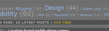
His font-size trick, conveying the number of posts in a category in a non-explicit (but very efficient) manner, is a good example. He does supplement the font size with an explicit number in brackets:
A more general issue raised here is the navigation method. Lists and text-based devices are very clear, but usually not very informative, in that you could change the words used and the meaning of the navigation device would change: no information is conveyed except through the textual content.
You’ve got alternatives: Circus, a PhD project at the HKU, and Brian Hoffer’s plugin interface.
However, what we’d be looking for is something that is very easy to understand, and that supplies subtle, peripheral cues in a helpful, and unequivoqual manner.
If I have time, I’ll be working on several ideas to tackle the problems described above…
The default skin (which I’m using, barely modified) that ships with the software I use to maintain this site (b2evolution) features the following elements:
- in the main body of the page, one of the following:
- a most-recent-first list of posts (10 at a time), some of which I have truncated with a “read more” link, starting from the latest post, grouped by day
- subsequent slices of 10 older posts
- slices of 10 posts corresponding to the requested group of posts, with the following criteria available:
- posted on a certain date (one day, a month, a whole year)
- posted within a certain category or that category’s children (the controls are limited to one at a time but the system supports selecting several)
- containing a certain keyword (search results)
- the full text of a post (article)
- recently entered comments
- in the right-hand column, from top to bottom:
- an intro text, which has a link to my bio (a post), my company (an external web site)
- highlights: navigation links to the two most interesting “categories” of this site
- navigation to the “next page”, i.e. show 10 posts older than the ones currently displayed
- navigation to the site’s home page (cached version, which may not be up to date)
- navigation to the site’s home page (dynamic version, always up to date, slower to display)
- a calendar of the month the last post was in, with links on each day when a post was made, and date-based navigation
- navigation to the recent comments page
- search box
- categories tree (navigate to each category, including the number of posts in each category)
- date-based navigation (monthly “archives”)
- “Linkblog”, an ordered list of links to external web sites
- a “Misc.” bloc, containing administrative links to login or register
- a syndication block, containing links to access the site’s content using RSS feeds