Paul just forwarded me an interesting quote from the AIGA design forum, regarding text vs. visual representation.
Another common assumption is that icons are a more universal mode of communication than text. […] The endless icons of the digital desktop, often rendered with gratuitous detail and depth, function more to enforce brand identity than to support usability.
Might want to use once more the example of the olympic games icons representing the various disciplines, 75% of which are crystal-clear, leaving an obscure, hard-to-understand 25%. In a multilingual environment, it’s an interesting and challenging endeavor, and the systematic exploration of design problems often yields wonderful insight, but they’re indeed much more of a branding exercise, as one can see in the fact that the icons aren’t re-used, from game to game.
What a departure R. Buckminster Fuller‘s intro to Henry Dreyfuss‘s book, Symbol Sourcebook, An authoritative guide to international graphic symbols:
There loooms now into silent recognition a new exclusively visible language, that of roadside and street intersection signs, airport signs, and supermarket signs, etc., which accomodate the world-around motorist, air traveler and telephoner. [… The author] may be opening up a whole new world of exclusively visual language in which deafness would not prevent communication and comprehension of delicately nuanced meanings. […] Thus humans can be liberated to use their own cosmically powerful faculties to communicate what needs to be done […].
One must note that Dreyfuss’ own prose carefully limits his goals to an array of mainly industrial and scientific objectives, where his work has actually been quite influential.

What can you make out of this menu, without being able to read and understand Japanese?
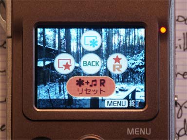
How about this one?
More on text vs. visuals
Paul just forwarded me an interesting quote from the AIGA design forum, regarding text vs. visual representation.
Might want to use once more the example of the olympic games icons representing the various disciplines, 75% of which are crystal-clear, leaving an obscure, hard-to-understand 25%. In a multilingual environment, it’s an interesting and challenging endeavor, and the systematic exploration of design problems often yields wonderful insight, but they’re indeed much more of a branding exercise, as one can see in the fact that the icons aren’t re-used, from game to game.
What a departure R. Buckminster Fuller‘s intro to Henry Dreyfuss‘s book, Symbol Sourcebook, An authoritative guide to international graphic symbols:
One must note that Dreyfuss’ own prose carefully limits his goals to an array of mainly industrial and scientific objectives, where his work has actually been quite influential.
What can you make out of this menu, without being able to read and understand Japanese?
How about this one?